A sad engineer’s habit, I’m intrigued by all those conventions, rules, schemes and standards that industries develop as a common language for communication and collaboration. The National Museum of Scotland’s 2022 ‘Design in Colour‘ exhibition showed some of Bernat Klein’s ‘colour-box’ panels (see third illustration on the smow blog-post) and I’m very grateful to curator Lisa Mason for sharing a reference to the Nordic Textile Union’s Barding scheme.
Bernat Klein’s Colour Box
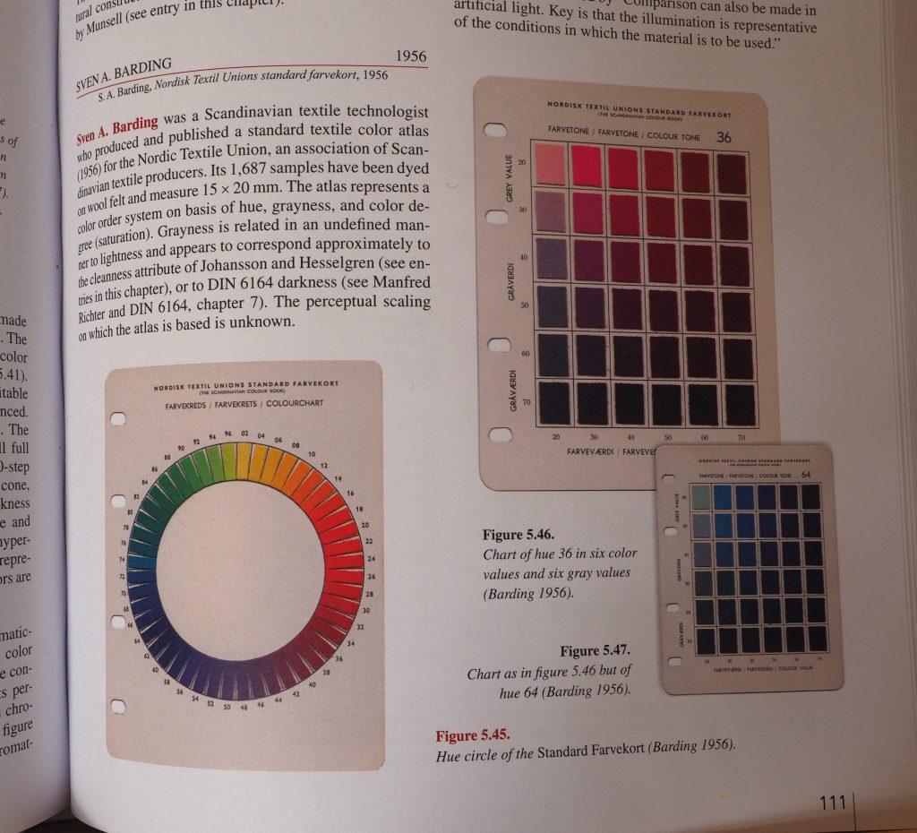
Bernat Klein must have been delighted to find Sven Barding’s textile colour atlas, with a standard numbering scheme that could be easily extended for his huge collection of ~5,000 colours.
- Dyed wool samples, specific to textiles.
- Modern, published in 1956.
- Nordic – he very much admired Scandinavian design.
For each hue, the standard has a 6×6 grid of 20-70% greyness / saturation; Bernat Klein’s colour box extended this to 9×9, or 10-90%.
Rolf G. Kuehni and Andreas Schwarz, Color Ordered: A Survey of Color Order Systems from Antiquity to the Present (Oxford: Oxford University Press, 2008), 111.
My own colour box
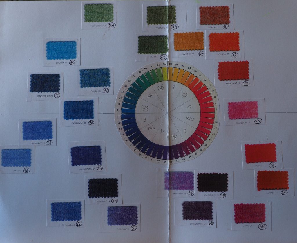
Here’s my own simple colour-box for the British Wool yarns used in the Sunset Shawl collection, arranged around the Barding colour wheel.
I mostly buy yarns from commercial spinners’ supported stock so find that this way of arranging their ‘given’ colours helps to match what I use in each piece and gives the woven collection a balanced overall theme.
Although Bernat Klein used his colour box extensively for design and communication with dyers and printers, Barding’s underlying scheme does not seem to have been widely adopted.
Gouache for ‘virtual sampling’
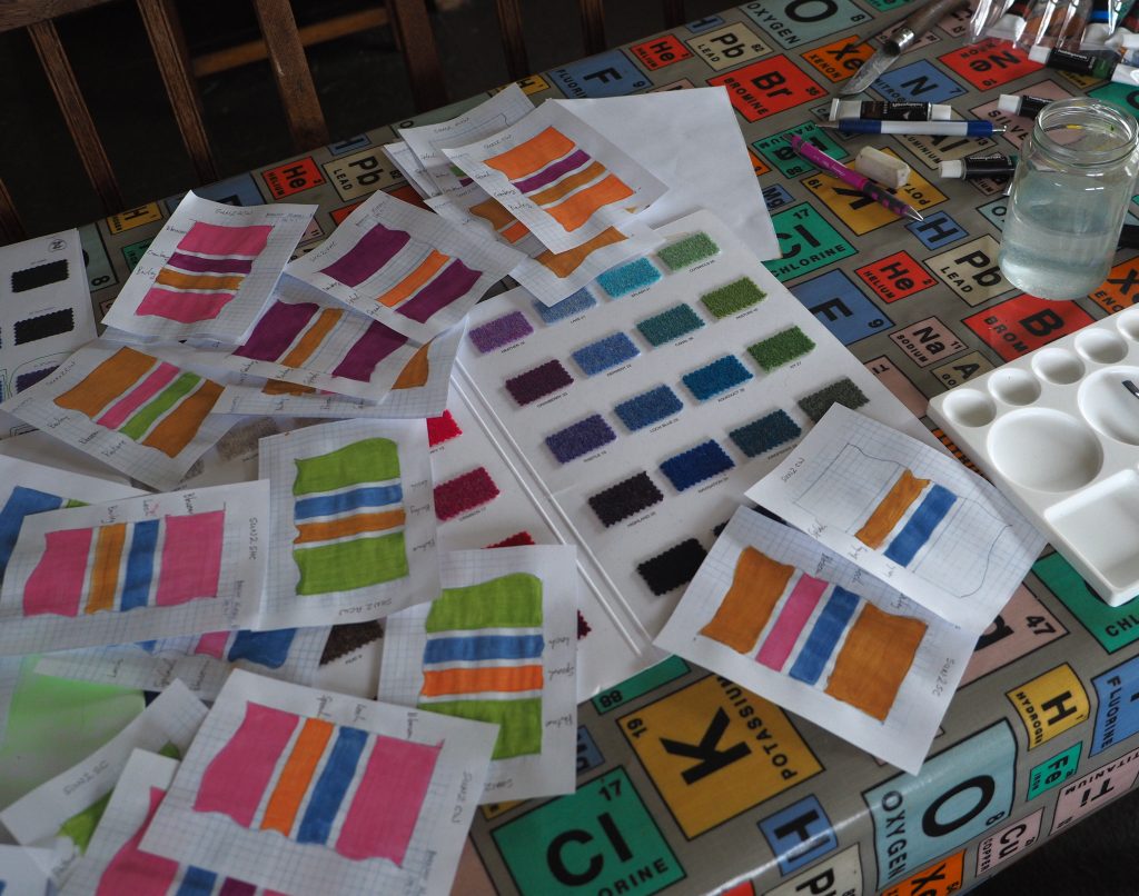
On a (2023?) Bernat Klein Foundation workshop with Joanne Yeadon called An Eye for Colour, we explored blending gouache colours.
The aim was to try and match subtle natural tones, like those in the human eye. Never having studied art, the big take-away for me was how adding complementary colours can control shade and depth.
It turns out even my cheap Hobbycraft set can quite accurately reproduce a commercial yarn palette, so gouache helps me visualise woven pieces and collections before I commit yarn or loom-time.